This site uses data saved in the cookie files and other technologies. If you agree to use cookie files click 'Allow Cookies'. Otherwise, click 'Cookie Settings' to allow or prohibit some cookie categories.
10% off all wallpaper, limited time only. No code required! close
-
Colour Match Paint
-
Colour match paint without compromise!
-
-
Wood Finishes
-

Shop Our Full Osmo Range
-
-
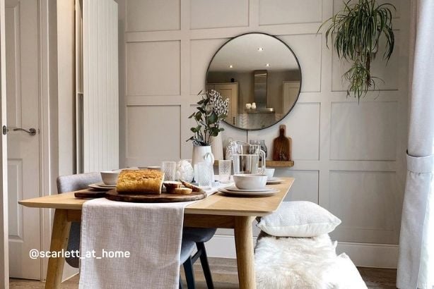
Home Styling
-
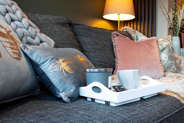
Curated Cushion Collection
-
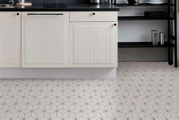
Peel & Stick Vinyl Floor Tiles
-
-
Latest Offers
-

NEW You can now find handy options like Currency and VAT settings here.
Site setup
Save and Close
Site Settings
Use the options below to customise your experience on the site.
Include VAT in Prices
Currency
Your account
Sign in to your account
New to decorating centre?
If you are new to Decorating Centre, simply click register and we'll ask you for a few details.
Sign up for DCO PRO.
For businesses, sign up to our trade account.
 Price Match Promise
-
 2pm Next Day Delivery
 -

-
 4.9 / 5 Feefo Rating
The Best Colours to Pair Rust-Oleum Steamed Milk With?

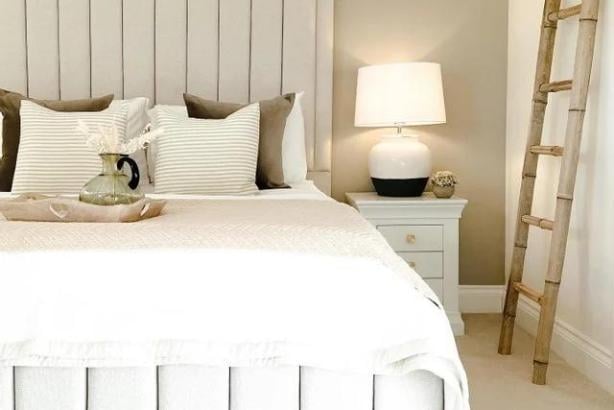
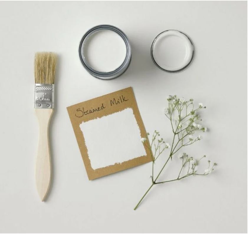
Steamed Milk has undoubtedly been one of the biggest colours of the year! Often referred to as the perfect off white as it's not too yellow and not too grey, this gorgeous neutral is the perfect base to create light and airy interiors!
This versatile shade (and Rust-Oleum’s handy product range) lends itself to so many different applications and it’s been great to see Steamed Milk everywhere from flooring to walls, woodwork to garden furniture and pretty much every project in between!
With this in mind I’ve popped together a few colour pairings with other gorgeous shades in the Rust-Oleum paint range below to show you a few ideas of how you can utilise Steamed Milk in your home!
Bold Neutrals
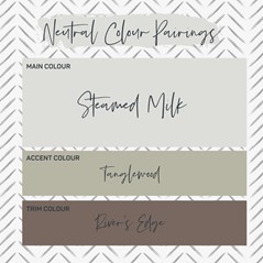
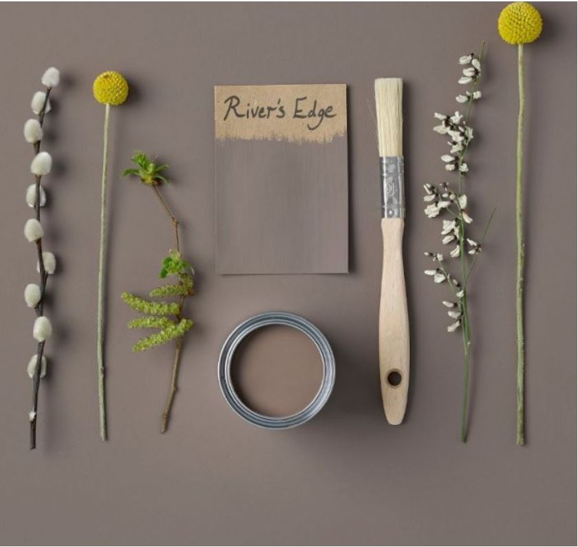
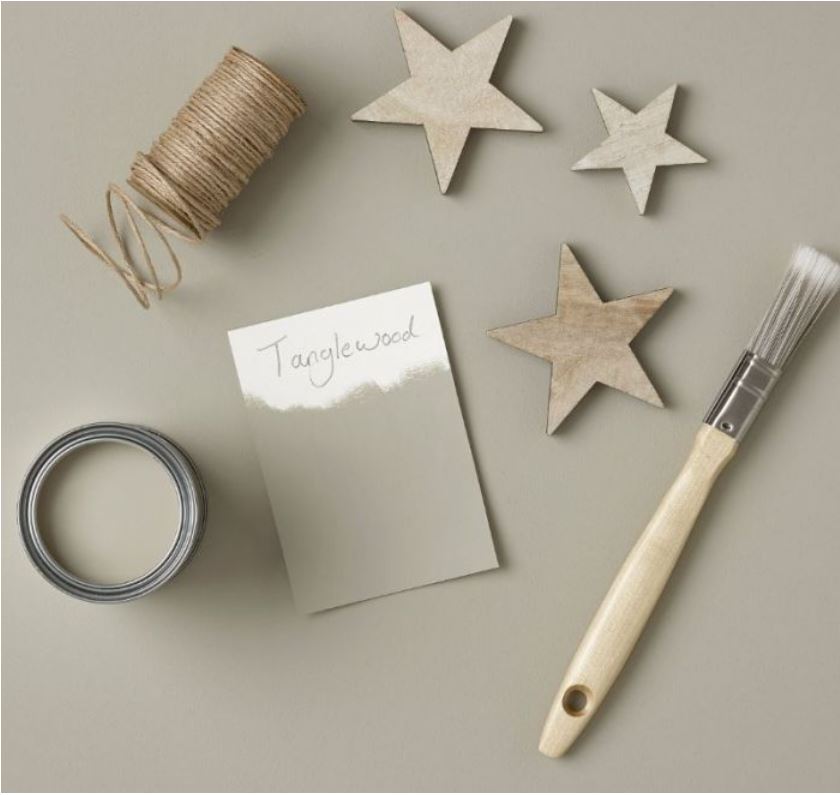
For this colour palette I went with a selection of beautiful warm tones neutrals. When designing a room there is a golden rule of colour schemes...60:30:10. For this colour scheme I would keep Steamed Milk as your main colour (the 60% in that golden rule!) which would keep the room light and open. I’ve then selected the gorgeous shade Tanglewood which is a delicious grey-brown shade that has a luxurious and mature feel for a feature wall or a painted cabinet wall/furniture. Finally I absolutely love a bold statement on woodwork so have opted for River’s Edge, an intense tone adding to the luxe feeling for this colour scheme! By adding the darker colour to your woodwork you help to create light and space in your room! Finally you would add warm accessories in similar tones to your tanglewood in your rugs/cushions to really pull this 60:30:10 rule together!
Soft Neutrals
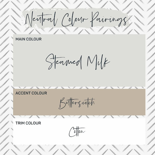
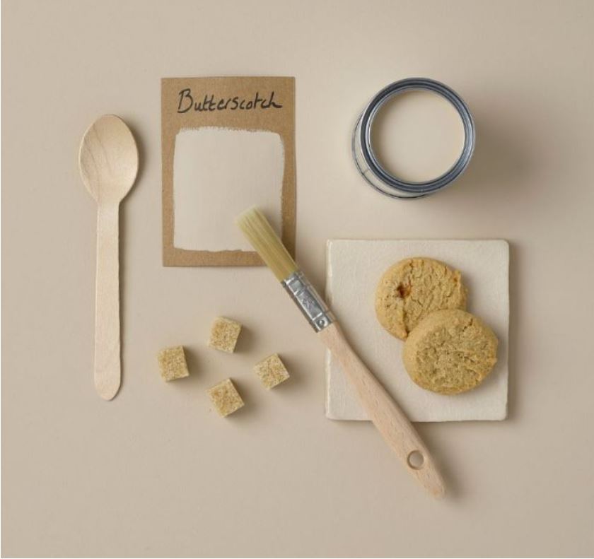
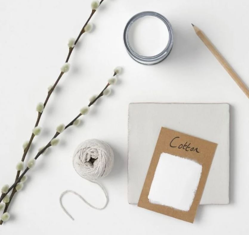
A bolder scheme isn’t for everyone so with this colour palette I’ve kept to some softer neutral shades. Our favourite Steamed Milk as your main colour with Butterscotch as your accent. Butterscotch is as delicious as it sounds, appearing like a colour of melted brown sugar, butter and cream! I can picture this scheme with a colour block of Butterscotch, painted like a thick border around the top half of the room which would be a great statement and place to show your gorgeous artwork or photographs. Finally I’ve kept the woodwork white with Cotton as this is such a versatile design choice and keeps your room feeling simple and light.
A Monochromatic Twist
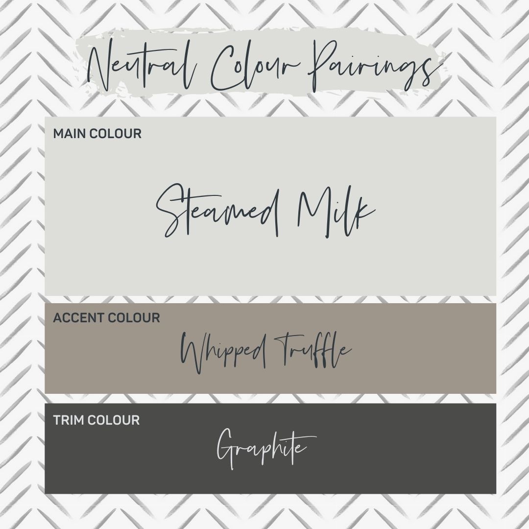
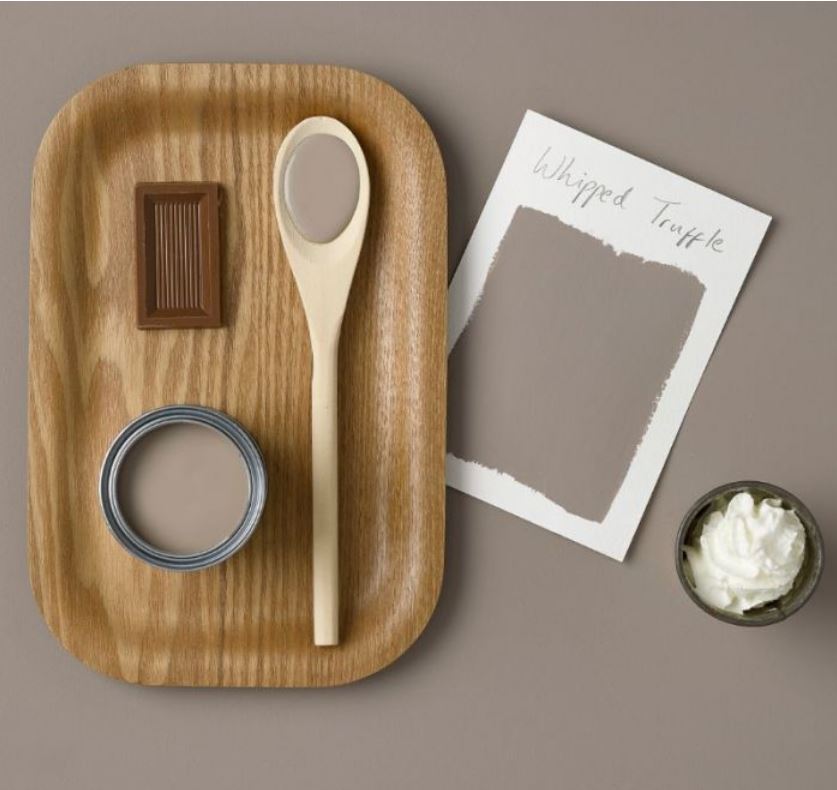
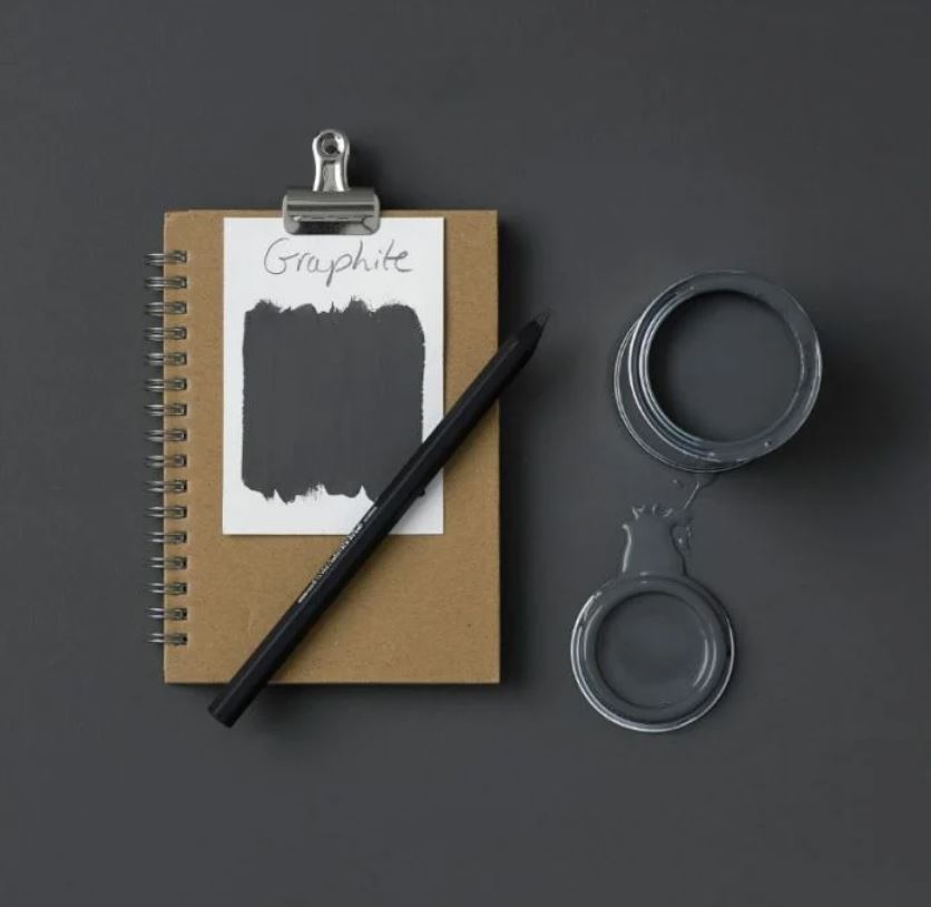
Monochromatic colour schemes are based on a single colour and use various shades to add tones and a sense of differentiation in a space. This is where your Steamed Milk will work beautifully with Graphite, almost black shade that registers warmly. The twist comes from the addition of the warm brown Whipped Truffle which is a smooth taupe with hints of chocolate! It softens the harshness of the contrast of the almost white with the almost black and will warm up your interior! As I mentioned in scheme 1, adding the darker colour to your woodwork can make the walls appear lighter, create a more contemporary feel to your colour scheme and can also help to elongate your walls as they appear lighter and draw the eye up. Again I would add accessories in the same tones as your whipped truffle especially bringing in some of your more natural textures and materials such as wicker and hessian baskets/rugs etc which are hugely on trend at the moment!
A Simpler Scheme
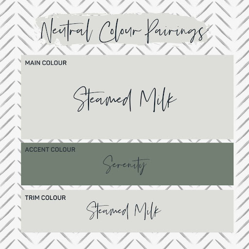
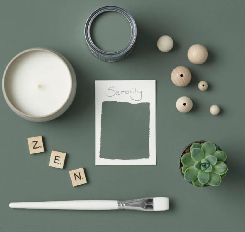
Finally for a simpler scheme I would suggest keeping your walls and woodwork in Steamed Milk. The benefit of this Rust-Oleum range is that you can get their 110 colours in any type of paint so the same Skimmed Milk is available in their Chalky Wall paint and also their Matt Furniture Paint or Kitchen Cupboard Paint which are both suitable for your woodwork. The benefit of keeping your walls and woodwork in the same shade are that it can help to make your walls appear taller and it can add a contemporary feel to your decor let alone the benefit of not having to be as careful with your cutting in! I love Steamed Milk with gorgeous greens so have opted for Serenity which is a rich, dusky green that evokes calmness and peace. This would make a perfect feature wall shade, colour block design or painted furniture feature. For the 10% in your golden rule 60:30:10,I would add brass or gold detailing to your room in handles, socket covers, coffee tables, and accessories!
So hopefully that's helped to give you a little bit of inspiration for one of the biggest colours of the year! I would love to see your mood boards or styling ideas using the Rust-Oleum range and with 110 colours in the range you aren’t limited to just these! What colour schemes would you like to see next?