This site uses data saved in the cookie files and other technologies. If you agree to use cookie files click 'Allow Cookies'. Otherwise, click 'Cookie Settings' to allow or prohibit some cookie categories.
Free delivery on orders over £60! close
-
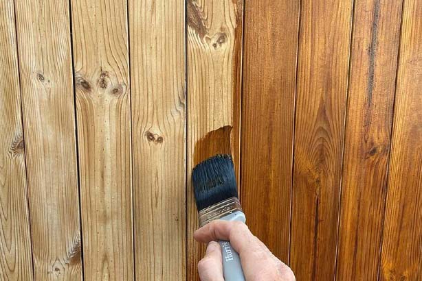
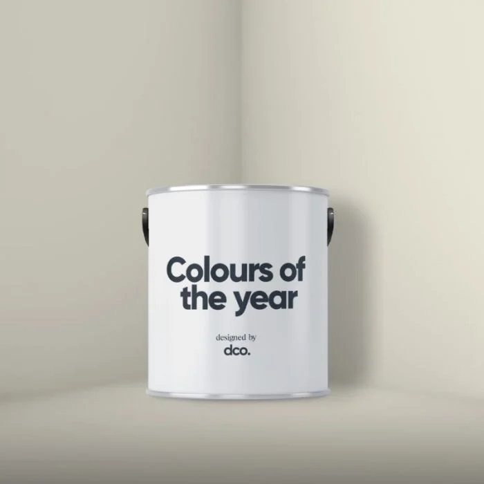
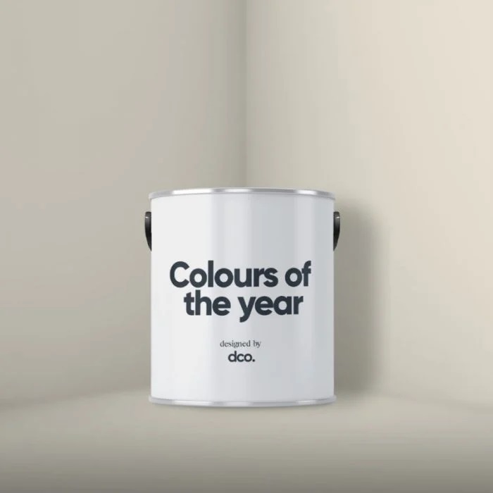
Colour Match Paint
-
Colour match paint without compromise!
-
-
Wood Finishes
-
Shop Our Full Osmo Range
-
-
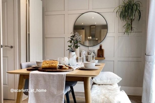
Home Styling
-
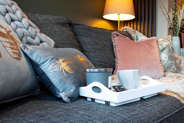
Curated Cushion Collection
-
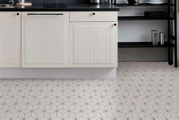
Peel & Stick Vinyl Floor Tiles
-
-
Latest Offers
-

NEW You can now find handy options like Currency and VAT settings here.
Site setup
Save and Close
Site Settings
Use the options below to customise your experience on the site.
Include VAT in Prices
Currency
Your account
Sign in to your account
New to decorating centre?
If you are new to Decorating Centre, simply click register and we'll ask you for a few details.
Sign up for DCO PRO.
For businesses, sign up to our trade account.
 Price Match Promise
-
 2pm Next Day Delivery
 -

-
 4.9 / 5 Feefo Rating
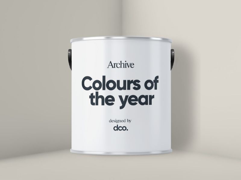
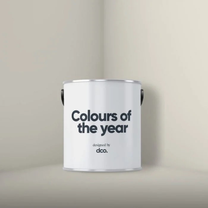
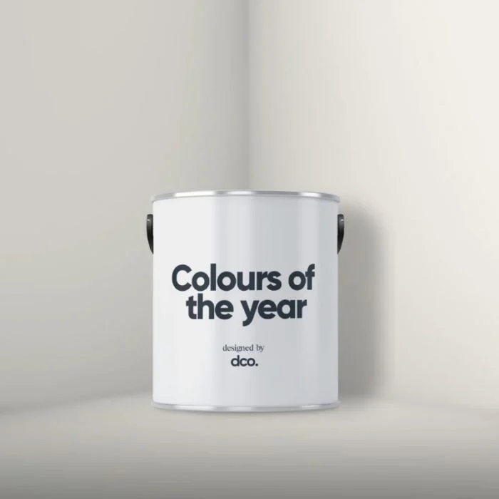
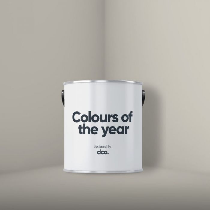
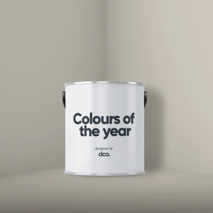
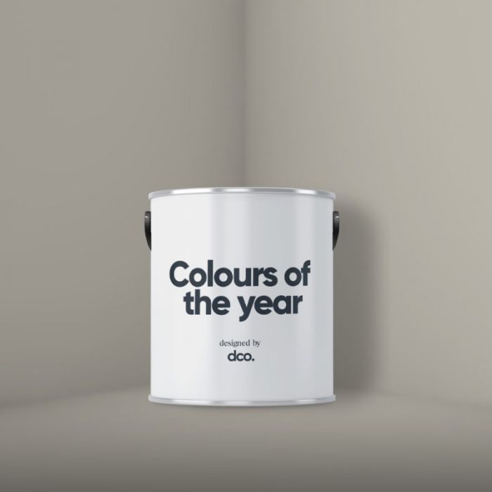
It's that time again, new year means a fresh batch of colours of the year! Each year paint manufacturers spend hours pouring over trends, making predictions and setting the tone for our colour journey in the following year. They make their announcements from about September/October and every year I enjoy a good look through them but can’t help but feel I disagree!
In this first blog of 2024 we’ll talk about:
- The official colour trend forecasts for 2024
- Our best selling shades for 2023
- The all important DCO Colours of the Year 2024
- Colour pairings and inspo with your 2024 colours of the year.
First up, what are the forecasts saying?
Don’t get me wrong, I like the colours that have been picked up and shared as the 2024 colour trend forecasts however I feel like they’re not speaking to us as users of the colours. Bear with me whilst I waffle my way through this and hopefully you’ll see what I mean (and therefore why I go for it and create my own!!!)
Pantone
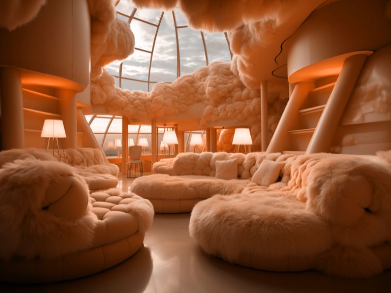
Each year pantone announces a colour of the year and this isn’t just focussed on home interiors or the UK, this is a global trend that they see crossing all areas of design. This year's pantone colour of the year is Apricot Crush which is a bright and vibrant orange shade. I never read too much into the pantone colour of the year as it's not specific to our industry but what I do draw from this, and the colours I’m seeing on the catwalks of oranges, browns and deep purples, that the focus of 2024 will continue to be on warmer shades.
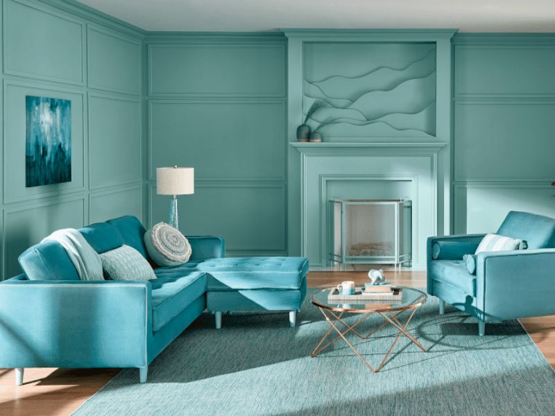
Sherwin Williams/Valspar
These guys are the same company (Valspar will be the brand we recognise as their UK brand, SW is their US brand) and they have released a colour of the year under both and both are shades of blue. The commentary from SW was that after a year of cosyness and warmer tones, 2024 is going to be the year of fresh starts which blue delivers in droves. I do like the Upward colour they have released but I don’t yet agree that we’re moving on from wanting cosy and soothing vibes in our homes in the main…this kind of shade I think would be good for certain rooms where you want to feel energized and invigorated.
Behr
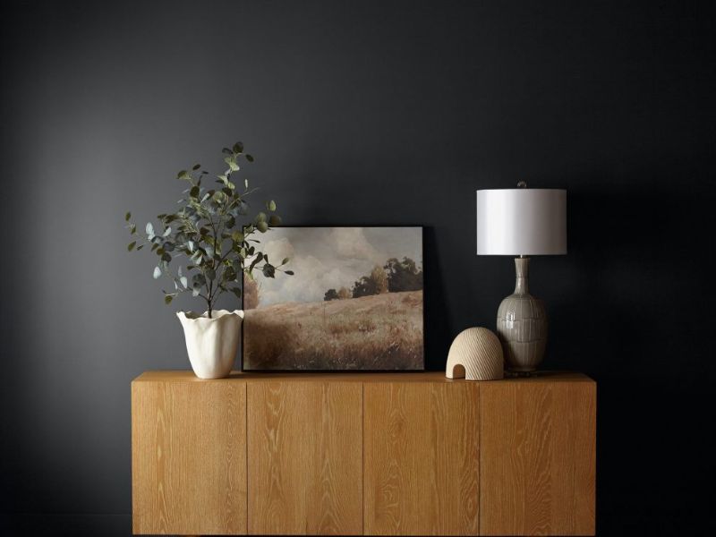
As a contrast to their off-white choice in 2023, Behr have selected a deep almost black shade ‘Cracked Pepper’ as their colour of the year as they believe that “creating a sense of comfort and belonging will continue to drive design decisions—but now, as life returns to its more familiar rhythms, it’s time to allow our senses to come alive”. I love the colour and I love the gorgeous rooms using deep and bold shades like these but personally, I think colour of the year should cater to a wider audience…and you won’t find masses and masses of us queuing up to paint our full room almost black…
PPG
So PPG is the manufacturer of Leyland and Johnstone’s paints which you all know I love! They have a gorgeous range of colours in their voice of colour charts and I can see from the efforts of colour panels they share with us as stockists they really do put so much time into announcing their colour of the year. This is very US led as PPG is headquartered in the states and it's their larger market so I feel like Limitless is a huge miss for us here in the UK. Whilst I completely agree on their choice of a warmer toned shade I really just can’t get behind a yellow…I think it needs work!
Dulux
So Dulux has huge success each year with their colours of the year but the last two years I’ve just not been convinced. Their 2024 colour Sweet Embrace is a delicate lilac shade and it is pretty, but like with the Sherwin Williams feedback I just don’t think we will be championing ‘cool tones’ as our main colour direction this year. They have a place in our homes but I don’t think they’re the main choice.
So where does that leave us? As I mentioned to pull together my own colours of the year I like to look at these trend forecasts but also in what my customers are seeking out and purchasing. I run a weekly colour clinic on Instagram in addition to being in regular discussions with you guys in store, on socials, on email or live chat and I know what you’re asking for….in a world where we can select from over 19,000 colours many of you want the choice narrowing down and you need help with your neutrals to create a calming and balanced space.
The next piece of the puzzle, is checking sales on my previous years colours of the year to basically check whether or not my assumptions were right! I am a little greedy and select a small number of shades each year and I can see whether what I’ve done has fit the bill!
Colours of the year 2023
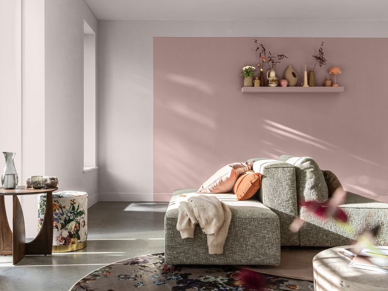
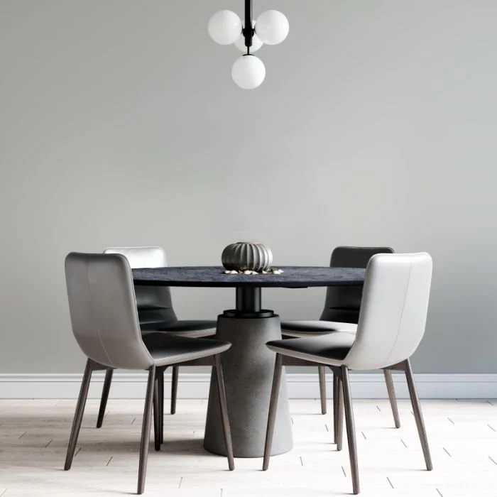
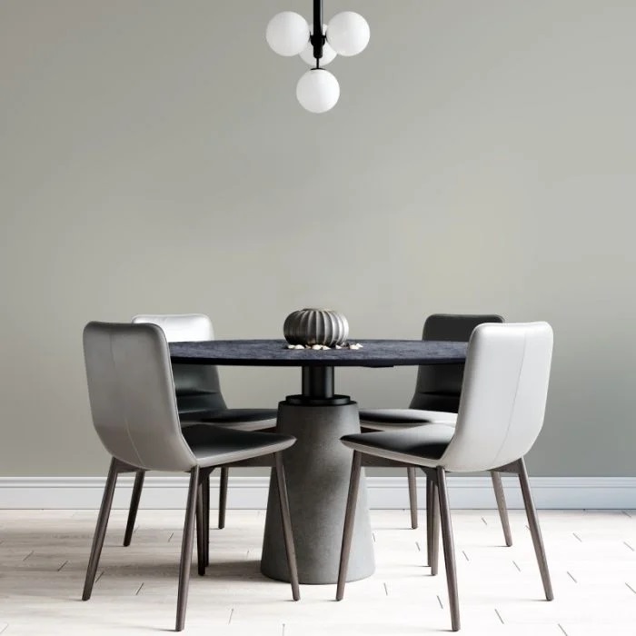
So how did my 2023 colours of the year go? I changed it up a little last year, I did a curated selection of colours but I did select an overarching shade - On Point as my ultimate colour of the year. As the name suggested, this was the perfect balance of not too cream, not too grey, it was ‘on point’. You all agreed, it outsold my other shades significantly with the majority of my other best sellers being neutrals or off whites. The only exception was the popularity of a couple of greens, both darker and lighter shades, showing you were all still really loving the green home interiors trends.

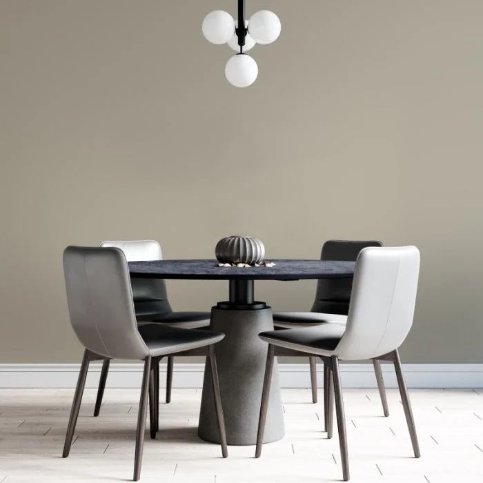
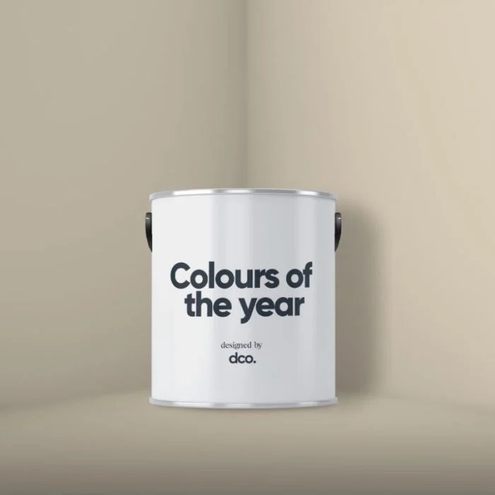
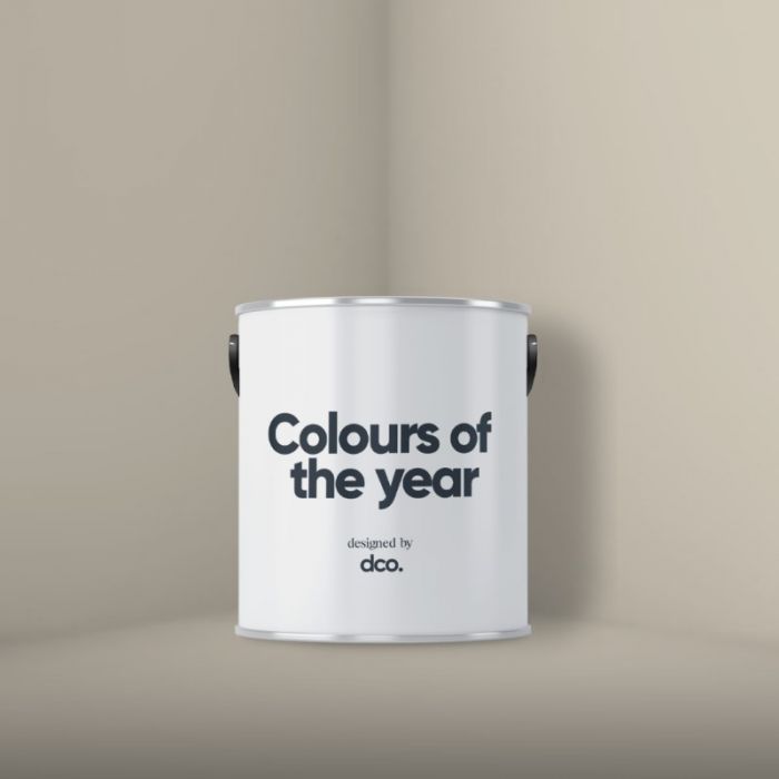
COTY 2024
So now you’ve seen a little about how I narrowed down and selected my colours of the year, it's time to talk about 2024. Based on all of your feedback and sales I knew I actually needed to deliver some off whites and neutrals, in addition to some colour direction.
Off Whites:
I feel like warming tones are definitely still the key for 2024 (which I’ll jump to in a moment) so I wanted to ensure I had off white choices which provided some warmth to coordinate. I’ve still included ‘Windswept’ which is a cooler toned off white to cover all bases though don’t panic!
Windswept
Windswept is a pale, grey toned off white with soft green undertones. The subtle addition of the grey/green undertones of Windswept will help to neutralise bright, yellow natural light in a south facing space and will pair beautifully with cooler toned feature wall colours.
Warmer Than White
Warmer Than White is a beige toned off white that takes some of the starkness and coolness out of a standard brilliant white. The greige undertones in this shade make it the perfect coordinate for almost any shade and in any room orientation or it can be used as a standalone colour choice where you’re wanting to brighten and lighten the room!
Fresh Start
Fresh Start is a beautiful off white shade with a hint of creamy warmth. The soft cream undertones help to deliver an off white that feels pure and clean whilst taking the starkness out of a pure brilliant white paint colour. Fresh Start is the perfect choice when trying to brighten up a room, especially a colder toned north facing room and would even work as a coordinating woodwork paint colour for anyone wanting to step away from a brilliant white.
Snug as a Bug
Snug as a bug feels like a cosy blanket for your room due to its warming creamy yellow undertones. With more depth of colour to it than fresh start but still light and bright, this airy shade is the perfect choice in any room orientation, especially cooler spaces which would benefit from some warmth!
The Right White
The Right White is a beautiful off white shade with a hint of warming brown. Naming it ‘the right white’ felt appropriate as this stunning off-white is the perfection option in a colder north facing or east/west facing room. The warmer undertones in the shade will neutralise the colder blue tone from the natural light and the brightness of the colour will help to make your room feel more open and spacious. Whilst it excels in these room orientations, it's the perfect coordinating white as it's suitable in any room orientation and can be paired with any paint colour and work flawlessly.
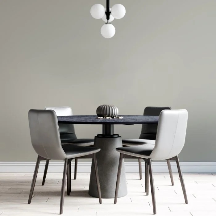
Neutrals:
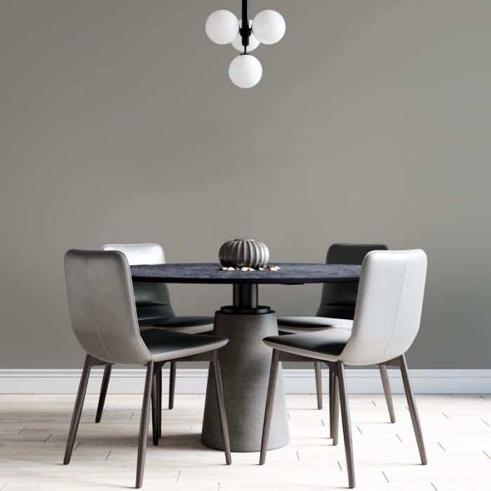
For people that wanted coordinating shades with a little more depth or standalone neutrals to keep a nice flow throughout their home I’ve pulled together a set of 5. Similarly to the off whites, I’m leaning more towards the warming undertones with these due to the overarching theme of this year but I have still included some cooler undertoned neutrals for anyone wanting suggestions for that type of colour scheme.
Not Quite Cream
Not Quite Cream is a beautiful neutral shade with a warming bronze undertone. Get the benefit of warming creamy tones without an over powering yellow feeling with this beautiful shade. Use this colour as the perfect coordinating shade for warm green tones, pinks, browns and deeper taupe shades.
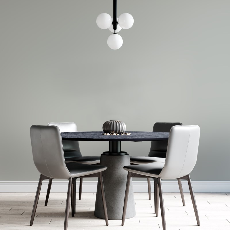
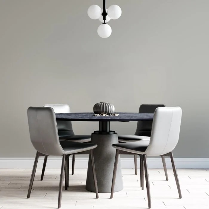
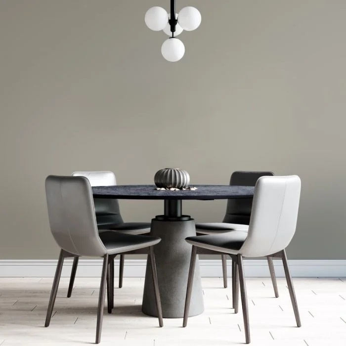
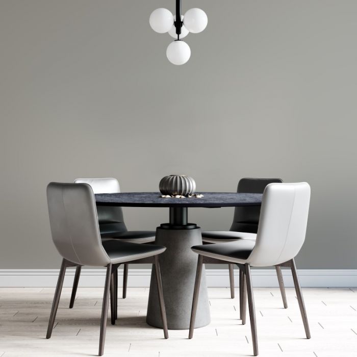
Naked Beige
Naked Beige is a beautiful greige shade, the perfect balance between beige and grey. Naked Beige could work as a standalone colour or would work as a coordinating shade for most colours in brighter rooms that can take a neutral with some depth. Naked Beige is suitable for any room orientation.
The Natural Choice lives up to its name, a beautiful neutral greige shade which leans a touch more on the grey to the beige side. With warming sandy undertones, this gorgeous shade will coordinate with almost all shades and accessories including natural woods, metallics and bolder tones.
Even Better Beige
Even Better Beige as the name suggests is the perfect beige tone for your home. Soft grey undertones balance this shade so as not to appear too creamy and yellow. Suitable for any room orientation and as a coordinate for any shade, this really is the best shade of beige around! The depth of this tone also means it will work as a standalone shade in your room.
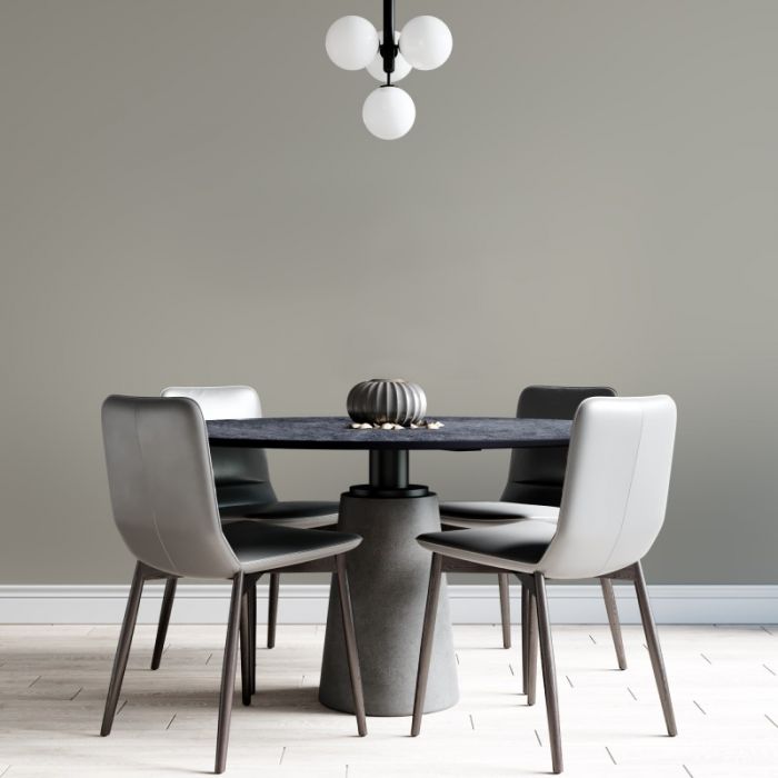
Classic Taupe
Classic Taupe is a soft grey tone neutral with a hint of brown. Taupe as a colour is described as not quite grey, not quite brown with a warming earthly quality and Classic Taupe delivers just this. As a mid toned neutral, this beautiful shade would work with any of our other neutral coord’s of 2024 for split wall or panelling designs or would work as a standalone colour for a full room. Calming in nature, feel grounded with this beautiful earthly tone.
COTY Colours
So already the neutrals and off whites are proving hugely popular and clearly fitting the bill on what a number of you have been looking for but I did want to ensure I gave you all some colours that are going to meet the trends for 2024 (and by this I mean you’ll find them easier to accessories as cushions, throws, cups, plates etc will all be in similar styles!). As I’ve hammered on about I’m all about the warming and soothing I wanted to quickly highlight the benefits of decorating with warmer colours before delving into the 5 shades I’ve selected.
It may feel a little obvious but by decorating with warmer toned colours you will evoke feelings of comfort and cosyness; they make a room feel inviting and comfortable and foster a welcoming atmosphere. It's why they’re a fantastic choice for a room which you usually use for relaxing or winding down from a hectic day.
Warmer shades can also help to make the room feel warmer. They give a perceived temperature by visually warming the space which is why they’re the best option in a north facing room to help balance out the space. These shades can also help to improve the lighting in these rooms as they reflect light in a way that adds warmth and richness.
The final point I’ll make about warmer tones is how versatile they can be. They are easy to coordinate with and combine with other colour schemes or design styles and compliment so well with natural textures and materials. This in turn provides a great connection alongside the warming and earthy shades bringing the outdoors in and further delivering a comforting space in your home.
So you can likely see now why I’m so big on warmer tones at the moment, and this clearly matches with most of the trend forecasts (including the overarching pantone colour of the year, what we’re seeing on fashion catwalks and therefore what follows through into interior accessories) so I narrowed down these core colour of the year shades.
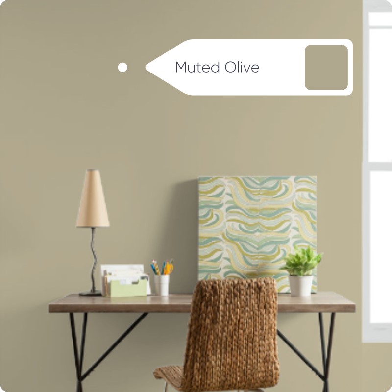
Muted Olive
Muted Olive is an understated olive green with a yellow ochre undertone. Using green in your home can provide soothing and calming properties as well as being the colour to connect you with nature and the outdoors. It's important to select grey or neutral toned greens to achieve this balance rather than overwhelming your senses. The warming nature of the ochre helps to deliver this neutral feeling green and makes it an ideal colour choice for any room orientation.
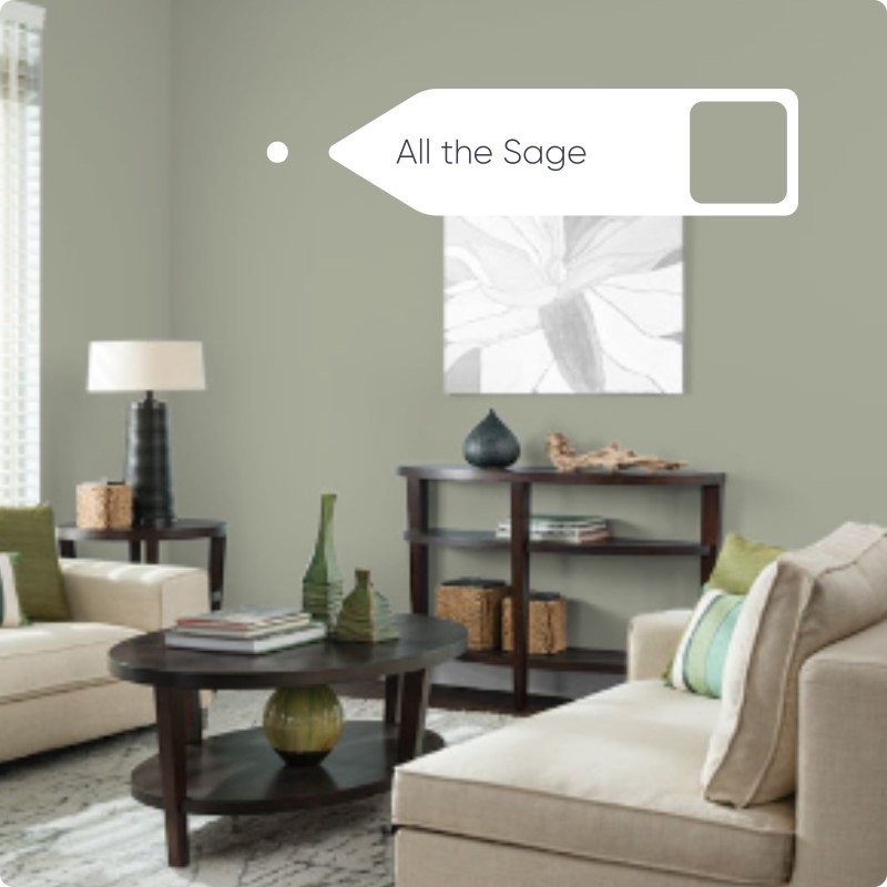
All The Sage
All The Sage is a beautifully muted sage green shade with calming grey undertones. To qualify as a ‘sage green’ the shade would need to have earthy and grey undertones just like the herb which has woody stems and silver tipped leaves so All The Sage fits the bill! Much like our Muted Olive shade, All The Sage delivers the calming and restorative properties you would look to achieve when decorating with green as it utilises its grey undertones to de-saturate a bolder green. All The Sage would work best when placed in a South. East or West facing room and would lend itself to any room especially a Kitchen which benefits from the link with nature and bringing the outdoors in.
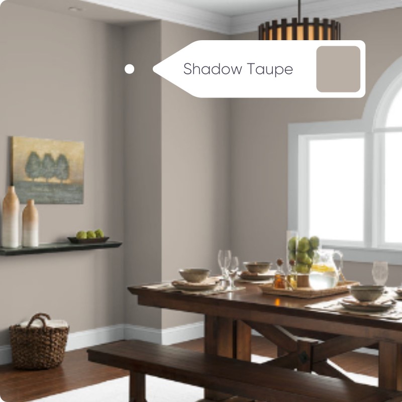
Shadow Taupe
Shadow Taupe is a beautiful blend of beige and grey to deliver a stunning taupe shade. Hitting a mid tone depth of colour, the reddish undertones in the shade give it a hint of a mauve feel and avoid it feeling too cold. Taupe shades are effortless to decorate with as you’ll find they match mostly any colour scheme and room orientation in addition to being easy to accessorise! Shadow Taupe delivers a sophisticated and relaxing sanctuary vibe to your space and pairs beautifully with ‘The Right White’ or ‘The Natural Choice’ to complete your room scheme!
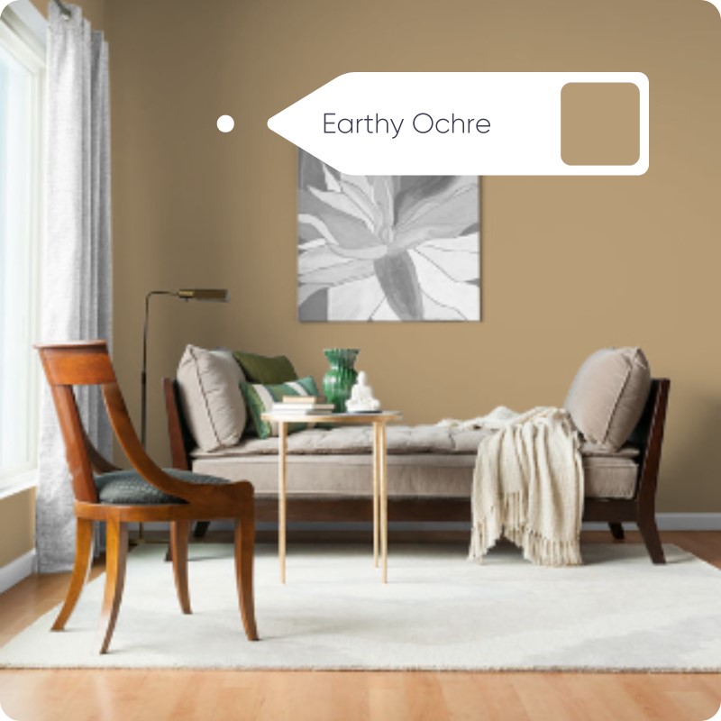
Earthy Ochre
Earthy Ochre is a beautiful clay yellow shade with warming brown undertones. Ochre is an earthborn pigment which can range from yellow through to a deep reddish shade. This beautiful colour has brownish undertones making it feel very much like an earthy ochre shade! This instantly cosy colour is the perfect choice to create a soothing home sanctuary, warming any north facing room and providing a link with nature due to its earthy brown roots. Pair it with copper or gold accessories, green tones and natural woods to accessorise.
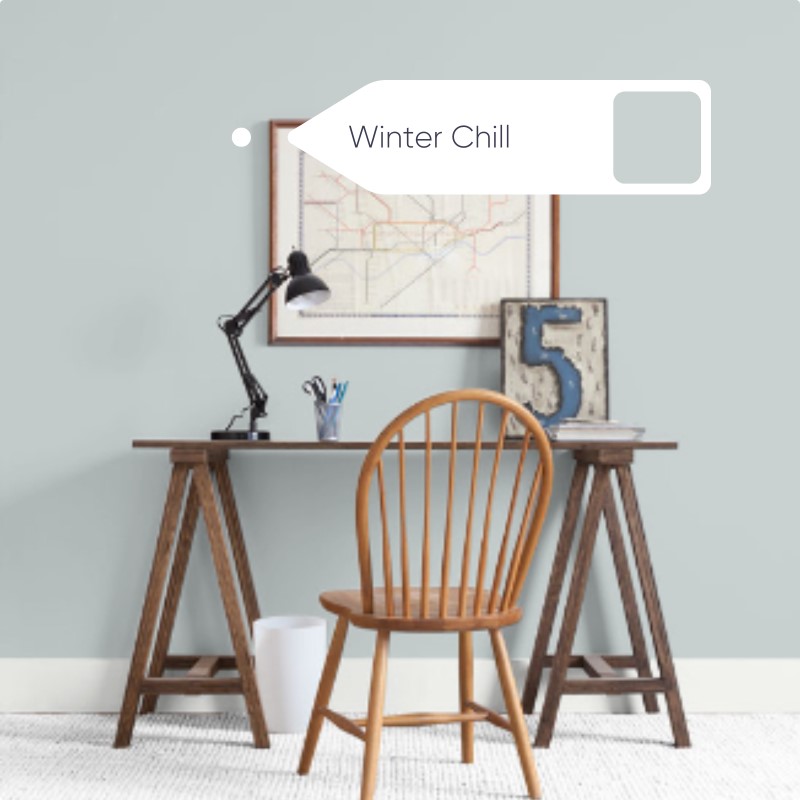
Winter Chill
Winter Chill is a light, cool blue with grey undertones. Using blue in your interior scheme can uplift your mood or calm a busy mind so utilise it in a room that you would start your day in or use as a place to unwind. Winter Chill delivers a beautifully calming shade due to grey undertones making it a delight for your senses. Pair it with an off white like ‘Warmer Than White’ in an East or South facing room to avoid the space feeling cold.
So there you have it, a full round up of my colour’s of the year. Hopefully my thought processes here make sense and you like the shades I’ve created for the 2024 colour of the year! I’d love to see how you’re using these in your home!
Helen x
Related Products
-
 DCO Colour of the Year 2023 - On PointFrom £4.49 £3.74
 -
 DCO Colour of the Year 2024 - Naked BeigeFrom £4.49 £3.74
 -
 DCO Colour of the Year 2024 - Even Better BeigeFrom £4.49 £3.74
 -
 DCO Colour of the Year 2024 - Classic TaupeFrom £4.49 £3.74
 -
 DCO Colour of the Year 2024 - The Right WhiteFrom £4.49 £3.74
 -
 DCO Colour of the Year 2024 - WindsweptFrom £4.49 £3.74