This site uses data saved in the cookie files and other technologies. If you agree to use cookie files click 'Allow Cookies'. Otherwise, click 'Cookie Settings' to allow or prohibit some cookie categories.
Free delivery on orders over £60! close
-
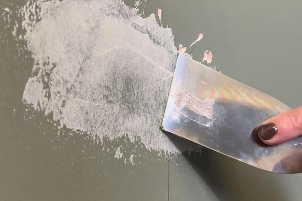
Colour Match Paint
-
Colour match paint without compromise!
-
-
Wood Finishes
-
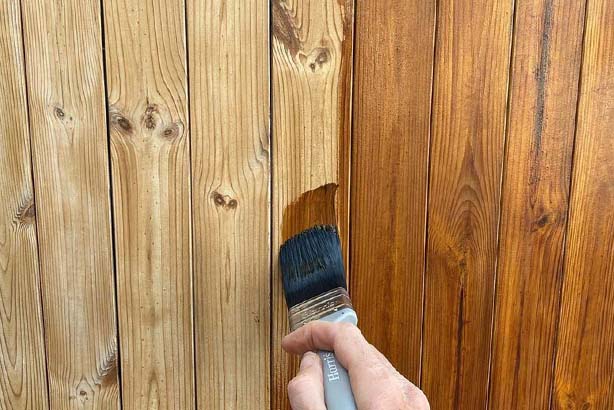
Shop Our Full Osmo Range
-
-
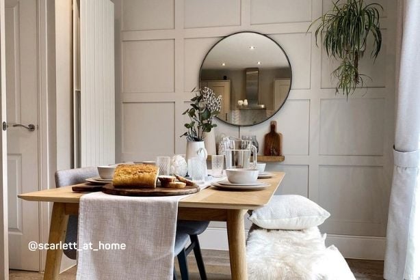
Home Styling
-
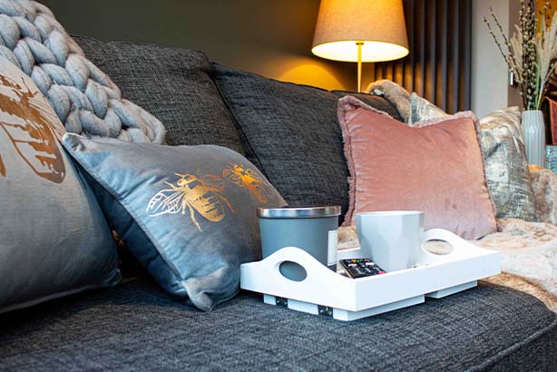
Curated Cushion Collection
-
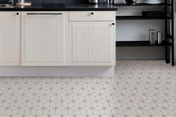
Peel & Stick Vinyl Floor Tiles
-
-
Latest Offers
-

NEW You can now find handy options like Currency and VAT settings here.
Site setup
Save and Close
Site Settings
Use the options below to customise your experience on the site.
Include VAT in Prices
Currency
Your account
Sign in to your account
New to decorating centre?
If you are new to Decorating Centre, simply click register and we'll ask you for a few details.
Sign up for DCO PRO.
For businesses, sign up to our trade account.
 Price Match Promise
-
 2pm Next Day Delivery
 -

-
 4.9 / 5 Feefo Rating
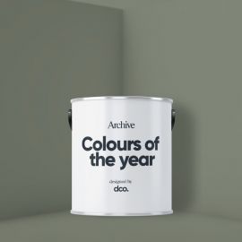
An introduction to the DCO Colour Of The Year 2023
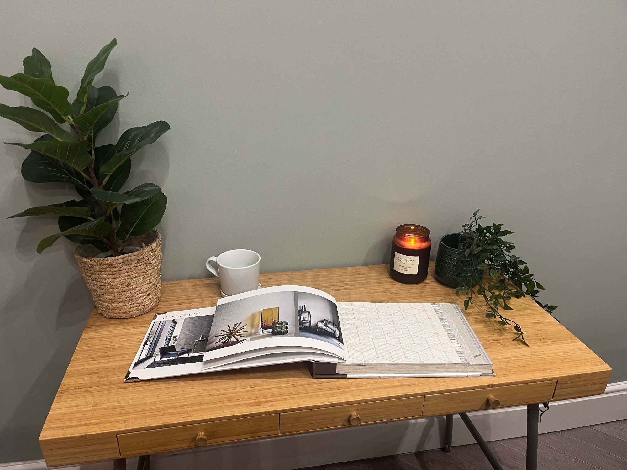
We’re here! It's 2023! Hope you all had a wonderful time over the festive period whatever you were up to and are back, ready and raring to hit 2023 with a bang! As always we’re starting the year with our colours of the year. Many companies end up releasing these in September/October of the previous year and I just don’t always feel that they’re representative of how we’re actually wanting to decorate our homes. I shared some sneak peeks over on Instagram in October and the general consensus was that they weren’t really fitting the bill! So I’ve trawled through trend reports for 2023 (not just for home interiors), reviewed other colours of the year for 2023, reviewed what people are desperately seeking out and finally I’ve reviewed our own popular shades to set a direction for the 2023 colour of the year.
As with last year I literally can’t just select one shade. That’s not helpful for anyone. We need some choice but choice with a direction, coordination and some sense so just like in 2022 I’ve created key themes for 2023 but differently this year they’re all centered around one core shade. So without further ado, let's jump into colour of the year (COTY) 2023!
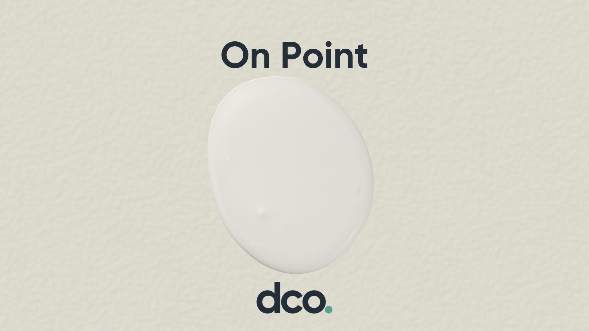
On Point
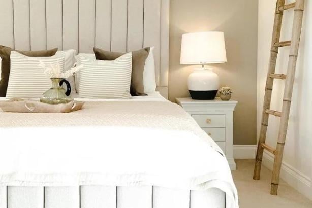
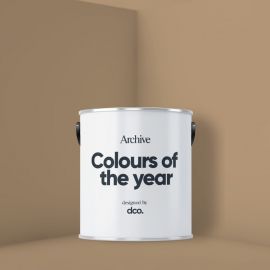
As I mentioned, I have selected one core colour that runs throughout the key trends for 2023 as a staple shade and I felt like there was no better name for this than ‘on point’! People are continuing to seek out the perfect shade somewhere between cream and grey, (aka greige!), as these can provide serenity and simplicity to your space whilst providing a touch of sophistication. It's so important to have a staple go-to neutral that is versatile and suitable for any type or room or any room orientation which is exactly why my colour of the year for this year has been to focus on a single neutral at the core of COTY2023. They are the perfect coordinate for bolder feature walls, a calming neutral that can balance a home or a strong enough shade that can be used on its own. This is exactly what I’ve achieved with On Point (even if I do say so myself!) which sits perfectly between a cream and a grey to provide the ultimate neutral. A hint of umber (orangey/brown!) pigment helps to balance the shade providing coziness and calm and avoid it from leaning too far into the grey spectrum. On point is such an adaptable hue that grounds all three of our 2023 trend colour palettes so let's take a closer look at each!
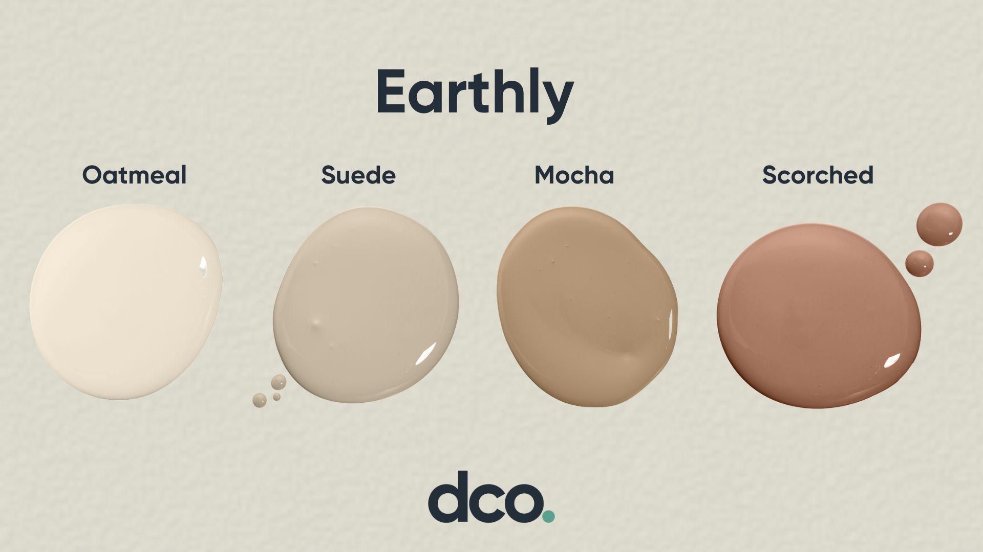
Earthly
Ok so this is a bit of a cheat as we had earthy last year however there continues to be a switch from cooler tones to warmer ones which we can see across the home interiors from accessories to fabrics to wallpapers and paint colours. After the success of last year's earthy palette I wanted to update the collection with some more daring shades, amping up the orange undertones, browns and reddish shades. Utilising earth tones in your home helps to build a connection with nature. These beautiful warmer tones work as both grounding neutrals but also delicate accent shades to warm up your space and create infinite cosy vibes. Earthly tones also offer the perfect backdrop for your furniture to help pull together your scheme and provide a cohesive and visually relaxing space. Packed with more of the natural made pigments such as oxides, the warming earthly palette delivers a gorgeous selection of shades across the taupe spectrum for a gentle and soothing space.
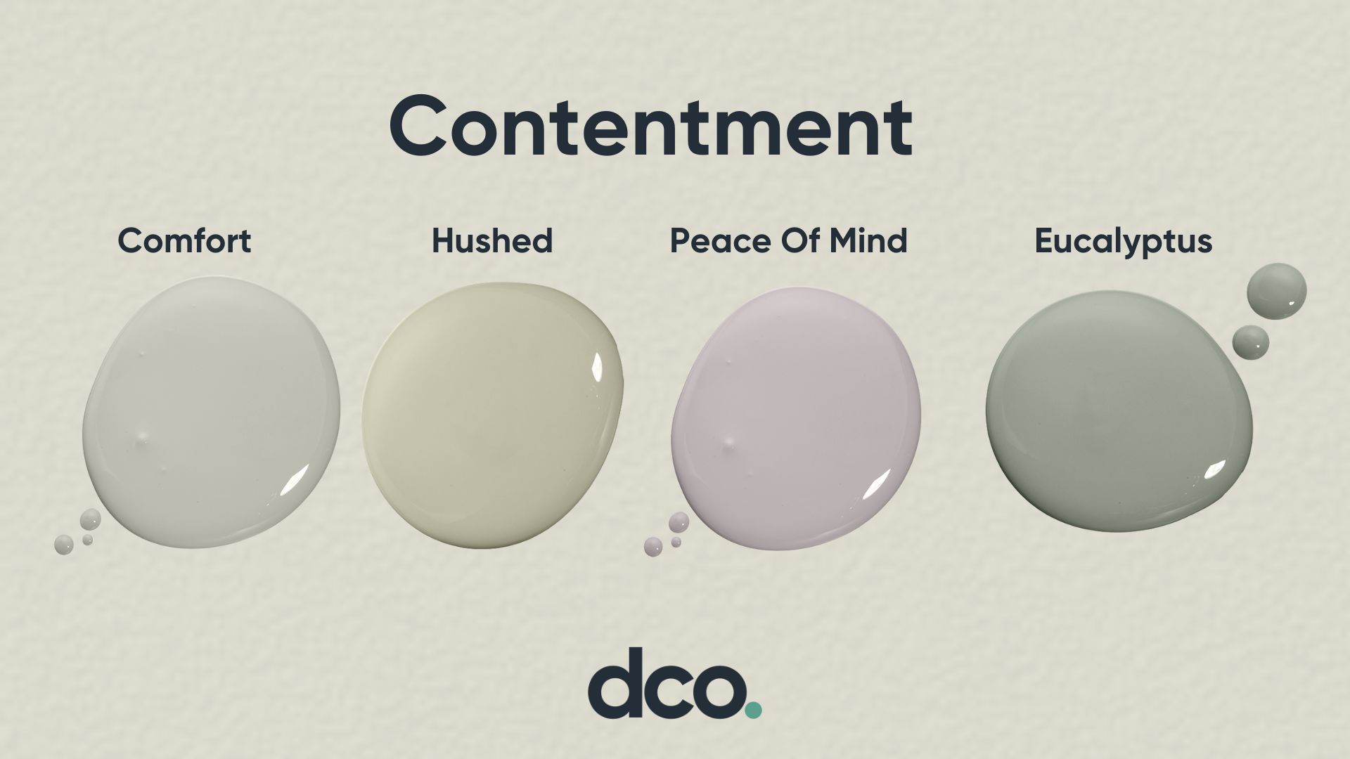
Contentment
Again this 2023 trend builds on last year's wellness collection. The aftermath of covid has completely changed how people see and use their home and this will continue into 2023. It's so important that we create our own retreat in our home whether that's because we’re continuing to spend additional time there due to working from home or needing that sanctuary to come back to after a challenging day. The wellness collection had a key focus on green and blue shades and contentment builds upon this. It's the next stage, focussing on encouraging relaxation as it turns up the cool factor and providing contrasting tones to deliver a sense of depth to your space. These beautiful shades work in harmony to create a calming environment with a shot of glamour including key shades for 2023 like a soft lavender, stoney greys and beautiful greens.
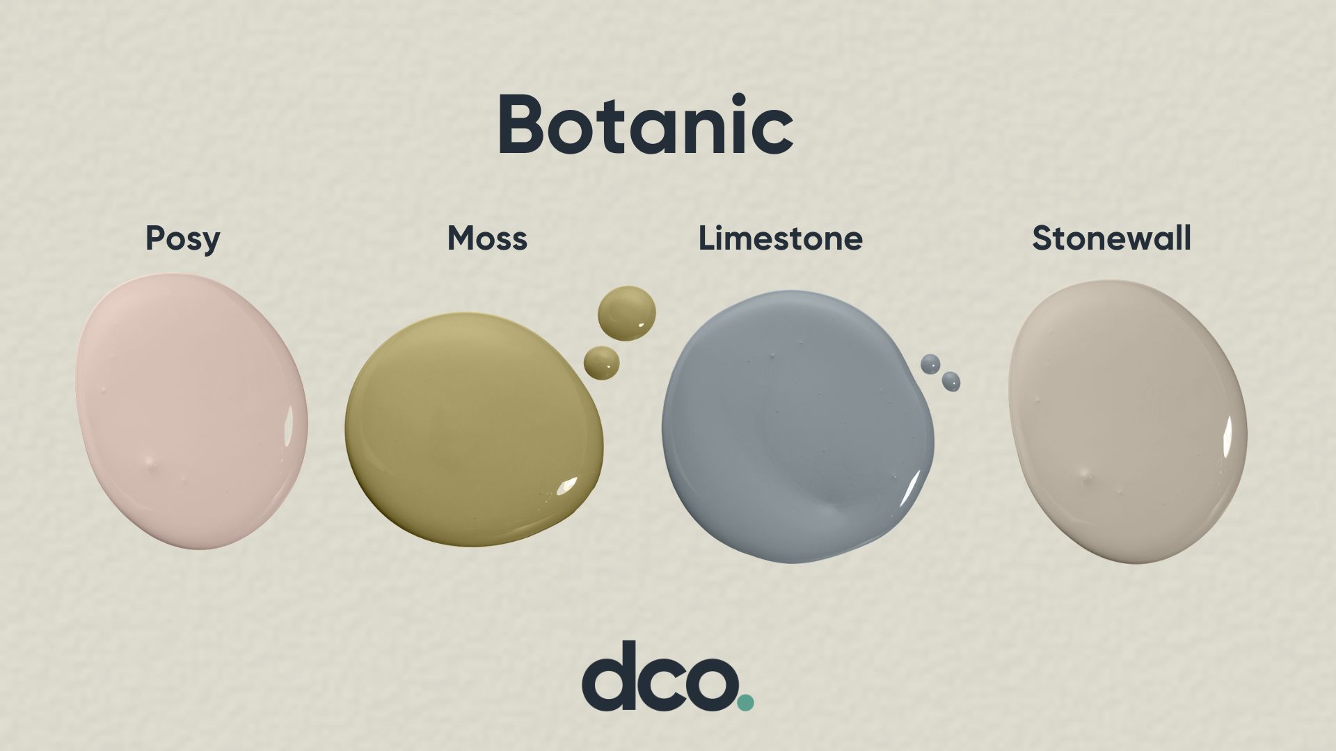
Botanic
The final trend for 2023 is a blend of heritage inspired colours from nature and the world around us to create a warm and reassuring environment that brings the outdoors in. Using this outdoors in approach to your home interior is also known as biophilic design which is proven to have a number of benefits to how you feel in your own space. Biophilic design is defined as a connection with nature and its proven to inspire, boost productivity and create a stronger sense of wellbeing. It's about bringing the outdoors in and creating indoor environments that reference nature in both obvious and subtle ways for example with our colour, fabric, lighting and room layouts. This colour scheme would be the perfect choice for a home office, kitchen or bedroom space.
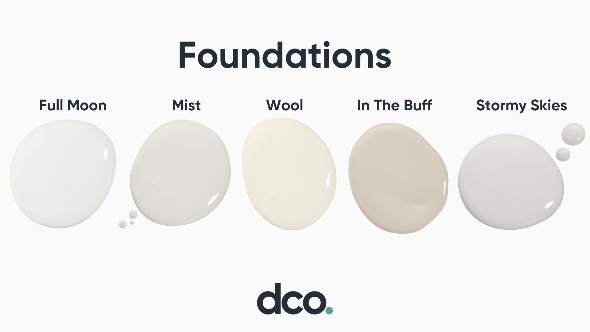
Foundations
So I said there were three trends and I lied. I couldn’t ignore the number of requests we get daily for recommendations of off whites, coordinates or soft neutrals so I’ve added a sneaky additional selection of shades under our COTY 2023 heading. I’ve named this collection foundations which as you can imagine is designed to deliver just what you’d expect; a selection of neutral and off white shades to provide the foundation to any room. Imagine these shades as a base, options for ceilings, trims, radiators which again would all pair beautifully with most shades or to be used on their own. There are a number of key benefits to decorating with off white and pale neutral shades, the key being that it can make your space look and feel bigger. White's have reflective properties, they can beautifully reflect all of the colours and lights falling on them meaning they work in any room setting and with any furniture or accessories you want to pair them with! Using these foundational colours can also help your scheme to feel stylish and sophisticated in addition to having great properties for creating a calm and serene scheme!
So there we have it! A full round up of the DCO colours of the year for 2023, focussed much more on colours that I can actually see being used in peoples homes whilst following the key home trends for 2023 around making your home your sanctuary, grounding your space by using colours and shades from outside and focussing on calming and restful spaces. I’ll be back with a deep dive into each of the individual trends and you can find full colour descriptions and other details on each of the product pages. As always if you have any questions or need any advice on colour pairings, which type of paint to use or anything in between please just drop us a message or a call. You can reach us on whatsapp, live chat, social media DM’s and emails!
Happy new year!
Helen x
Related Products
-
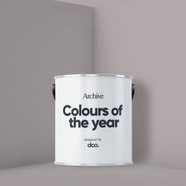
 DCO Colour of the Year 2023 - WoolFrom £4.49 £3.74
 -
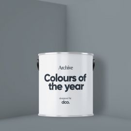
 DCO Colour of the Year 2023 - Stormy SkiesFrom £4.49 £3.74
 -
 DCO Colour of the Year 2023 - On PointFrom £4.49 £3.74
 -
 DCO Colour of the Year 2023 - MochaFrom £4.49 £3.74
 -
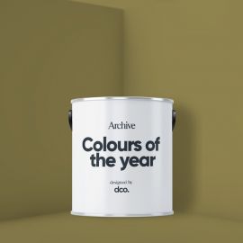 DCO Colour of the Year 2023 - MossFrom £4.49 £3.74
 -
 DCO Colour of the Year 2023 - LimestoneFrom £4.49 £3.74
 -
 DCO Colour of the Year 2023 - Peace of MindFrom £4.49 £3.74
 -
 DCO Colour of the Year 2023 - EucalyptusFrom £4.49 £3.74